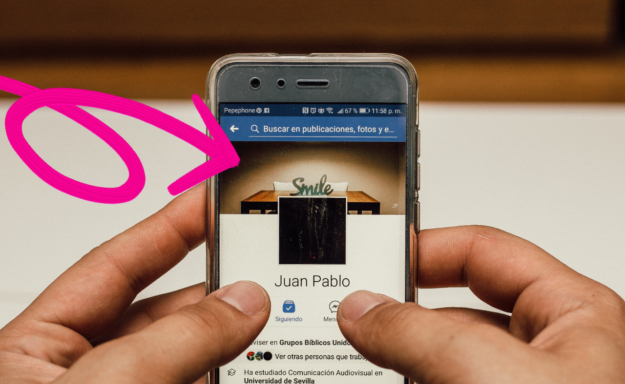
Your cover photo is one of the first things people notice when they visit your social media profile. Whether you’re using Facebook, Twitter, LinkedIn, or YouTube, a professional and eye-catching cover photo sets the tone for your personal brand, business, or content.
A well-designed cover photo can make your profile look more polished, boost engagement, and leave a positive impression on visitors. So how do you create a cover photo that stands out and aligns with your goals? Let’s dive into the key steps and tips for designing a professional cover photo for your social media accounts.
Step 1: Understand the Dimensions and Requirements
Know the Platform-Specific Sizes
Each social media platform has its own specific dimensions for cover photos, and it’s important to get these right to avoid your image being cropped or distorted. Here are the recommended dimensions for some popular platforms:
- Facebook: 820 x 312 pixels (desktop), 640 x 360 pixels (mobile)
- Twitter: 1500 x 500 pixels
- LinkedIn: 1584 x 396 pixels
- YouTube: 2560 x 1440 pixels
- Instagram Stories Highlight Cover: 1080 x 1920 pixels
Make sure to use the correct dimensions for the platform you’re working on to ensure your cover photo looks sharp and fits perfectly.
Safe Zones and Margins
Most social media platforms overlay text, profile pictures, or buttons over your cover photo. Ensure that important parts of your design aren’t hidden behind these elements by keeping the focal points of your design in the “safe zone”—the central area of the cover photo that won’t be cropped or covered by other elements.
Step 2: Choose a Clear Purpose for Your Cover Photo

Align It with Your Goal
Your cover photo should align with your social media goals. Are you promoting a business, building your personal brand, or showcasing your creative work? The purpose of your cover photo should be clear and easy for visitors to understand.
Some possible purposes for a cover photo include:
- Business Promotion: Highlight your product or service, display your brand’s tagline, or promote a special offer.
- Personal Branding: Showcase your personality, career expertise, or creative portfolio.
- Events or Announcements: Use your cover photo to promote upcoming events, launches, or important announcements.
- Content Creators: Display a cohesive theme related to your niche, such as gaming, photography, or fitness.
By clearly defining your goal, you can create a cover photo that effectively communicates the message you want to send to your audience.
Step 3: Use High-Quality Images or Graphics
Prioritize Professional Visuals
Nothing says “unprofessional” like a low-quality, pixelated cover photo. To create a professional cover photo, you need high-quality images or graphics that reflect the standards of your brand or content.
Here are a few options for sourcing high-quality visuals:
- Original Photography: If you have access to professional-grade photos of your product, team, or work, use them! Original photos add a personal and authentic touch to your cover.
- Stock Images: There are many websites like Unsplash, Pexels, or Shutterstock that offer high-resolution stock images. Choose images that align with your brand’s aesthetic.
- Custom Graphics: If you’re skilled with design software, consider creating custom graphics, illustrations, or typography to make your cover photo unique and professional.
If you’re not a designer, you can use platforms like Canva, Adobe Spark, or Crello, which offer easy-to-use templates and design tools to create high-quality cover photos.
Step 4: Incorporate Your Branding

Stay Consistent with Brand Colors, Fonts, and Logos
To create a professional-looking cover photo, it’s essential to incorporate your branding elements, such as colors, fonts, and logos. Consistency across your social media platforms strengthens your brand identity and helps your audience recognize you instantly.
- Brand Colors: Use your company’s colors (or personal brand palette) to create a cohesive look. Ensure the colors complement the background image and text.
- Logo: Place your logo in a visible area, but don’t let it overwhelm the design. It should be clearly visible but not overpower the overall aesthetic.
- Fonts: Stick to the fonts used in your brand’s marketing materials. Avoid using too many different fonts, as this can make your cover photo look cluttered. Two fonts, maximum, usually work best—one for the main message and one for supporting text.
By incorporating these branding elements, your cover photo will align with your overall identity, making it look polished and cohesive.
Step 5: Keep It Simple and Clear
Avoid Overcrowding
Simplicity is key to creating a professional cover photo. Overloading the image with text, graphics, and photos can make it look cluttered and confusing. Focus on one central message or image and keep the design clean and balanced.
Here’s how to keep it simple:
- Limit Text: If you’re including text, stick to a few key words or a simple tagline. Make sure the text is easy to read by using bold fonts and contrasting colors.
- Use White Space: White space (the empty area around your content) helps your design “breathe” and keeps it from feeling overcrowded. Don’t be afraid of leaving empty spaces in your design.
- Focus on One Visual Element: Whether it’s a product image, a person, or a logo, make one visual element the focal point of your cover photo. This creates a clear visual hierarchy and guides the viewer’s eye to the most important part of your design.
Step 6: Add a Call to Action (CTA)
Encourage Engagement
If you’re using your social media profile to promote your business or content, a cover photo is an excellent opportunity to include a call to action (CTA). A CTA encourages visitors to take a specific action, like visiting your website, signing up for a newsletter, or following your account.
Here’s how to incorporate a CTA into your cover photo:
- Text-Based CTA: Use clear, concise text like “Sign up now,” “Shop our collection,” or “Join our community” to guide your audience toward the desired action.
- Button-Style Graphics: You can design a graphic that looks like a button to make the CTA more visually appealing.
- Limited Time Offers: If you’re promoting a special offer, include a deadline or sense of urgency in your CTA to encourage immediate action (e.g., “Sale ends Friday”).
Make sure the CTA is easy to read and doesn’t clutter the design.
Step 7: Ensure Your Cover Photo Looks Great on All Devices

Optimize for Mobile and Desktop Views
Your cover photo needs to look great on all devices, from desktops to smartphones. Some platforms crop cover photos differently depending on the device, so make sure your design is adaptable.
- Test on Multiple Devices: Before finalizing your cover photo, test how it looks on both desktop and mobile views. Adjust any elements that might be cropped or hidden on different screen sizes.
- Keep Important Info in the Center: Many platforms crop the edges of the cover photo on mobile devices. To avoid important information being cut off, keep essential text and images in the center “safe zone” of your design.
By optimizing your cover photo for different devices, you ensure that it looks professional and polished no matter how visitors are viewing your profile.
Step 8: Refresh Your Cover Photo Regularly
Keep It Up-to-Date
Your cover photo should evolve as your brand or content changes. Refresh it regularly to reflect new campaigns, promotions, or announcements. Keeping it up-to-date shows that you’re active on social media and engaged with your audience.
Here’s when to update your cover photo:
- Seasonal Changes: Update your cover photo with seasonal themes or holiday graphics to keep it fresh.
- New Products or Services: If you’ve launched something new, update your cover photo to promote it.
- Rebranding: If your brand has gone through a refresh or rebranding, make sure your cover photo reflects the new style and direction.
Regular updates also give you a reason to re-engage with your audience and keep your profile looking current.
Final Thoughts
Creating a professional cover photo for your social media accounts is a powerful way to enhance your online presence and make a great first impression. By focusing on high-quality visuals, clear messaging, consistent branding, and device optimization, you can craft a cover photo that reflects your brand or content in the best light.
Remember to keep it simple, stay consistent with your branding, and refresh your cover photo regularly to keep your profile up-to-date. Whether you’re promoting a business or building your personal brand, a well-designed cover photo is a key part of your social media strategy.


