Creating a highly effective landing page is essential to running successful ads. A landing page is where users land after clicking on an ad, and it serves as the bridge between your ad and your conversion goal (sales, sign-ups, etc.). A well-designed landing page can significantly boost your conversion rates and help you get the most out of your ad campaigns.
In this guide, we’ll cover everything you need to know about making an effective landing page to run ads on platforms like Facebook, Google, Instagram, and others.
What Is a Landing Page?
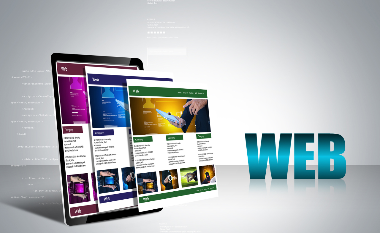
A landing page is a standalone web page designed to capture leads or drive sales through a focused call-to-action (CTA). Unlike a regular webpage, it’s created with a specific goal in mind — such as collecting emails, encouraging purchases, or registering users for an event — and is often tied directly to an ad campaign.
Why Are Landing Pages Important for Ads?
Landing pages are crucial because they:
- Drive Conversions: A well-optimized landing page can increase the likelihood that visitors will complete the desired action.
- Provide a Seamless Experience: Landing pages offer a focused message that aligns with the ad, making the transition smoother for visitors.
- Improve Ad Quality Scores: Especially on platforms like Google Ads, landing pages are factored into your Quality Score, which can reduce costs and improve your ad’s placement.
- Trackable Metrics: You can track how visitors interact with your landing page to improve future campaigns and refine your ads.
Step-by-Step: How to Create a Landing Page to Run Ads

1. Define the Goal of Your Landing Page
The first step in creating a landing page is to define your primary objective. Ask yourself, What action do I want visitors to take?
Some common goals for landing pages include:
- Collecting Email Addresses: For newsletter sign-ups or lead generation.
- Driving Sales: Encouraging visitors to purchase a product or service.
- Offering a Free Resource: Such as an ebook, webinar, or free trial, in exchange for contact details.
- Event Registration: Getting visitors to sign up for a webinar, event, or seminar.
By having a clear goal, you’ll be able to craft your landing page around this objective, ensuring that every element of the page works toward achieving it.
2. Create a Simple, Clean Layout
Simplicity is key to an effective landing page. You don’t want to overwhelm visitors with too much information, as it can distract from the main goal.
Best Practices for Landing Page Layout:
- Minimal Distractions: Remove unnecessary navigation menus, links, or content that could take users away from the page.
- Above-the-Fold CTA: Place the most important content (headline, CTA) above the fold so that visitors don’t have to scroll to see it.
- Whitespace: Use whitespace to make the page look clean and guide the user’s attention to key elements like the CTA.
- Mobile-Responsive Design: Ensure your landing page works smoothly on both desktop and mobile devices.
3. Craft a Compelling Headline
Your headline is the first thing visitors will see, and it needs to grab their attention immediately. It should communicate the value of your offer in a concise and compelling way.
Tips for Writing Effective Headlines:
- Be Clear and Specific: Avoid being vague. Let users know exactly what they’ll get.
- Highlight a Benefit: Focus on what the user gains by completing the action (e.g., “Boost Your Sales with Our Free Guide”).
- Use Action Words: Encourage action with strong verbs like “Get,” “Discover,” “Start,” or “Claim.”
4. Write Engaging Copy
Once the headline has caught your visitors’ attention, the rest of your page’s copy should persuade them to take the desired action. Every word on your landing page should support the goal.
Tips for Writing Landing Page Copy:
- Keep it Short and Focused: Avoid long paragraphs. Break up your copy into short, digestible sections.
- Highlight Benefits Over Features: Focus on how your product or service will solve the user’s problem or improve their life.
- Use Bullet Points: Bullet points make it easy to highlight key features and benefits at a glance.
- Social Proof: Include testimonials, reviews, or case studies to build credibility and trust.
- Clear Call-to-Action: Your CTA should stand out and clearly communicate what action users should take next.
5. Design an Irresistible Call-to-Action (CTA)

The CTA is the most critical element on your landing page. It should stand out and motivate users to take the desired action, such as “Buy Now,” “Get Started,” or “Sign Up.”
Tips for Creating a Strong CTA:
- Be Direct: Use clear and action-oriented language. Avoid vague phrases like “Submit.”
- Make it Visually Stand Out: Use a contrasting button color that draws attention.
- Create a Sense of Urgency: Phrases like “Limited Time Offer” or “Only 5 Spots Left” encourage users to act quickly.
- Positioning: Place your CTA in multiple locations on the page — at least one above the fold and another at the bottom.
6. Use High-Quality Visuals
The right visuals can make your landing page more engaging and appealing. Avoid stock images that feel generic, and opt for visuals that complement your message.
Visual Elements to Consider:
- Hero Image or Video: A high-quality image or video at the top of the page can visually communicate the benefits of your product or service.
- Infographics: If you’re explaining a process or complex idea, an infographic can simplify the information.
- Product Images: If you’re selling a product, showcase it with clear, professional photos.
- Trust Badges and Logos: Add logos of recognized brands or security badges to build trust with your audience.
7. Include Social Proof
Adding social proof — like testimonials, customer reviews, or user-generated content — is an excellent way to build credibility and trust. It shows potential customers that others have benefited from your offer.
Examples of Social Proof:
- Customer Testimonials: Use real quotes from satisfied customers, ideally with names and photos for authenticity.
- Case Studies: Share success stories that highlight measurable results.
- User Reviews: Include user ratings, especially if you’re selling products.
8. Optimize for SEO and Speed
While most landing pages are promoted via ads, it’s still important to consider SEO and page load speed. Faster-loading pages improve user experience and prevent visitors from bouncing.
SEO Best Practices:
- Relevant Keywords: Use keywords that relate to your product or offer in the headline, copy, and meta descriptions.
- Title Tag and Meta Description: Write a compelling title and meta description to encourage clicks from search engines (if you’re targeting organic traffic).
- Alt Text: Add alt text to images to make them more accessible and SEO-friendly.
Speed Optimization Tips:
- Compress Images: Use image compression tools to reduce file sizes without losing quality.
- Minimize Plugins: If using WordPress or other platforms, keep plugins to a minimum to ensure fast load times.
- Use a Reliable Hosting Provider: Ensure your hosting provider delivers fast server response times, especially if you expect heavy traffic from ads.
9. Set Up Tracking and Analytics
Once your landing page is live, it’s crucial to track its performance. Setting up tracking ensures that you know which ads are driving the most conversions and what needs to be optimized.
Tools to Use:
- Google Analytics: Set up goals to track conversions, bounce rates, and user behavior.
- Facebook Pixel: For Facebook ads, install the Facebook Pixel on your landing page to track ad performance and optimize your campaigns.
- Heatmaps: Tools like Hotjar or Crazy Egg allow you to see how users are interacting with your page.
10. A/B Test and Optimize
No landing page is perfect right out of the gate. A/B testing (or split testing) allows you to compare two versions of a landing page to see which one performs better.
Elements to A/B Test:
- Headline: Try testing different headlines to see which one resonates most with visitors.
- CTA: Test different CTA button text or colors.
- Form Length: If your goal is lead generation, try different form lengths to see if shorter or longer forms convert better.
- Visuals: Experiment with different images or videos to see which engages visitors more.
Final Thoughts
Creating a successful landing page for running ads requires thoughtful planning, design, and optimization. By focusing on a clear goal, writing persuasive copy, and incorporating strong visuals and social proof, you can create a landing page that not only complements your ads but also drives conversions. Don’t forget to continuously track, A/B test, and refine your page for the best results. You can also check our topic on – How To Create a Facebook Ad Account & Run Ads: Step-by-Step Guide
By following these steps, you’ll be well on your way to building landing pages that not only look great but also help you achieve your advertising goals.
